What is a CTA in blog writing? (+ 12 examples that convert)
Your audience sees thousands of messages a day—one well-crafted CTA is all it takes to stand out and convert.
Updated April 4, 2025

AI Summary
A call-to-action (CTA) is the cornerstone of any successful content marketing strategy. Whether you're guiding users to sign up for a newsletter, purchase a product, or book a demo, CTAs are pivotal moments that transform passive readers into active participants in their journey.
Crafting CTAs that truly resonate with your audience and drive conversions requires more than just slapping "Click Here" on a button. It demands strategic thinking about user psychology, placement, and value proposition.
Let's explore what makes a powerful CTA and how to create ones that deliver measurable results.
Key takeaways
- Effective CTAs align with the user's journey stage and provide clear value.
- Action-oriented language and strategic design increase CTA conversion rates.
- Regular testing of CTA variations is essential for optimizing performance.
- CTAs should be tailored to the context and intent of the content that surrounds them.
What exactly is a call to action in writing?
A call to action (CTA) is a prompt that encourages readers to take a specific action after consuming your content. It acts as a signpost guiding users toward the next stage in the user journey. That could be signing up for a newsletter, downloading a resource, or making a purchase.
CTAs can appear in various formats across your content:
- Buttons: The most recognizable form of CTAs, often appearing strategically throughout web pages.
- Hyperlinked text: Contextual links embedded naturally within your content.
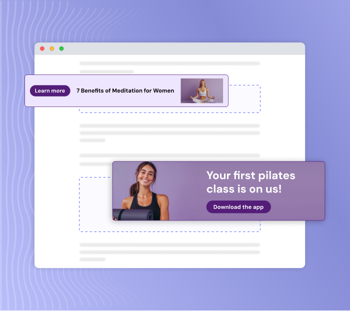
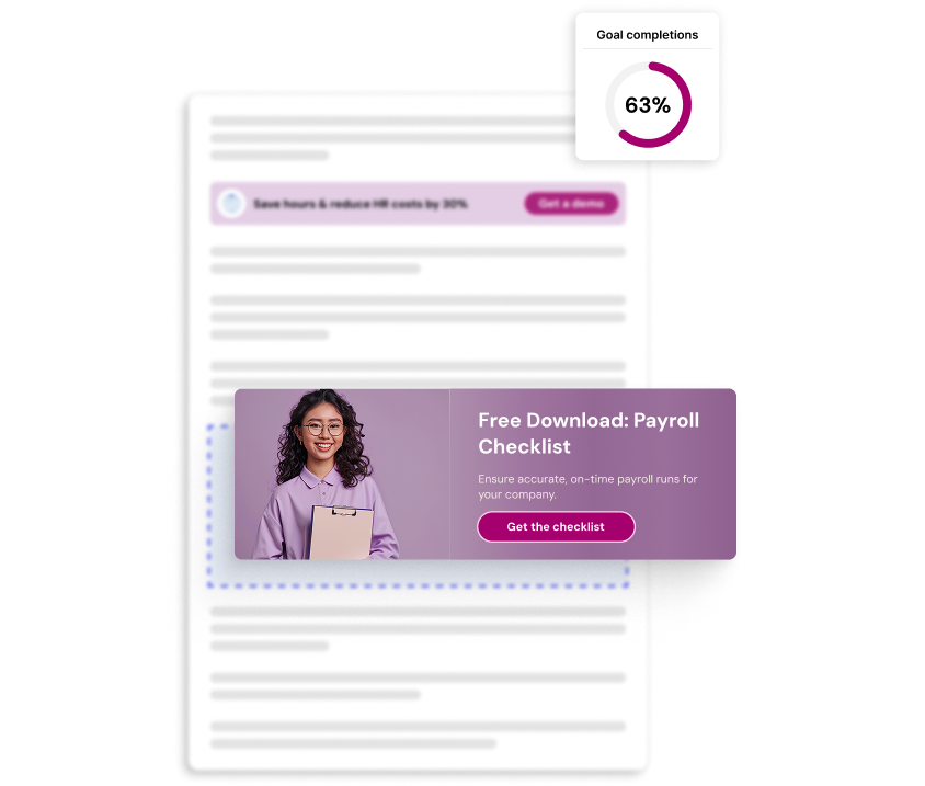
- Banners: Horizontal or vertical sections designed to catch attention.
- Forms: Email subscription boxes, contact forms, or other input fields.
- Pop-ups: Overlay messages that appear based on user behavior or timing.
- Image CTAs: Clickable images or graphics with clear action prompts.
Effective CTAs don't just ask for clicks—they create a bridge between your content and the value you're offering, making it clear why taking that next step benefits the reader.
» Explore 20 steal-worthy call to action examples that drive results.
Why your content needs compelling CTAs
Having great content without effective CTAs is like building a store with no checkout counter—you've attracted visitors but given them no way to convert. Here's why CTAs matter:
- Guides user behavior: CTAs provide clear direction on what to do next, eliminating confusion and reducing bounce rates.
- Boosts conversion rates: According to CXL, Michael Aagaard increased a landing page's conversion rate by 304% simply by moving the CTA button to the bottom of the page.
- Creates measurable results: CTAs give you concrete metrics to track, helping you understand what content resonates with your audience.
- Connects content stages: CTAs help move readers through your content marketing funnel, from awareness to consideration to decision.
- Increases content ROI: By turning passive readers into leads or customers, CTAs help generate actual returns from your content investment.
On average, 8 out of 10 people will read your headline, but only 2 out of those 10 will read the rest of your content. An eye-catching CTA can help recapture attention and drive meaningful engagement from those who do read through.
» Ready to boost your conversions? Find out how with our conversion rate optimization guide.
6 types of CTAs and when to use them
Not all calls to action serve the same purpose. Here are six types of CTAs and when to strategically use them:
1. Informational CTAs
These CTAs guide users toward educational content without requiring immediate commitment:
- "Learn more"
- "See how it works"
- "Discover why"
2. Direct action CTAs
These focus on prompting an immediate, specific action:
- "Buy now"
- "Sign up today"
- "Start your free trial"
3. Personalized CTAs
These CTAs are tailored to specific user segments or behaviors:
- "Continue where you left off"
- "Based on your interests"
- "Recommended for you"
A HubSpot analysis of over 330,000 CTAs revealed that personalized CTAs perform 202% better than basic CTAs. This significant performance boost comes from delivering relevant prompts that align with each visitor's specific needs and interests rather than using one-size-fits-all messaging.
4. Social sharing CTAs
These encourage users to spread your content across their networks:
- "Share this article"
- "Tweet your results"
- "Pin this for later"
» Find out how to add social media to your SEO conversion funnel.
5. Lead generation CTAs
These aim to collect contact information, typically through form submissions:
- "Download our free guide"
- "Get the checklist"
- "Register for the webinar"
» Try these SEO lead generation techniques to attract and convert users.
6. Continued engagement CTAs
These guide readers to related content, keeping them on your site:
- "Read more articles like this"
- "Explore related topics"
- "See also"
How to craft CTAs that actually convert
Creating high-performing CTAs isn't just about choosing the right words—it's about strategic placement, compelling design, and psychological triggers. Here's how to craft CTAs that drive real results:
1. Understand your audience's journey stage
Different CTAs work at different stages of the buyer's journey:
- Awareness stage: Educational CTAs like "Learn more" or "Discover how"
- Consideration stage: Comparison or demonstration CTAs like "See how it works" or "Compare plans"
- Decision stage: Action-oriented CTAs like "Start your free trial" or "Buy now"
» Learn how user journey optimization can boost your conversion rates.
2. Use action-oriented language
Start with strong command verbs that clearly communicate what action you want readers to take:
- Instead of "Information about our service," use "Discover how our service works"
- Instead of "Subscription," use "Subscribe today"
- Instead of "Click here," use "Get your free template"
3. Create a sense of urgency or exclusivity
Psychological triggers like scarcity and exclusivity can dramatically boost conversion rates:
- "Limited-time offer: Save 20% today"
- "Join 10,000+ marketers already using our tool"
- "Exclusive access for early subscribers"
4. Keep it clear and concise
The best CTAs communicate value quickly:
- Aim for 2-5 words when possible
- Front-load the value ("Get free access" rather than "Access for free")
- Avoid jargon or complex language
5. Make your CTAs visually distinct
Design matters just as much as copy. So, keep the following in mind when designing your CTAs:
- Use contrasting colors that stand out from your page
- Ensure adequate white space around your CTA
- Make buttons large enough to be easily clickable on mobile devices
- Consider using directional cues (arrows, images of people looking toward the CTA)
According to CXL, red CTA buttons consistently outperform green ones despite red's typical association with negative emotions. However, don't rush to change all your buttons to red. The overall visual hierarchy and design harmony of your page should take precedence over color trends.
A red button that clashes with your brand design may perform worse than a well-integrated button in a different color.
12 examples of high-converting CTAs
Let's look at real-world examples of effective CTAs across different channels and analyze what makes them work.
Website homepage CTAs
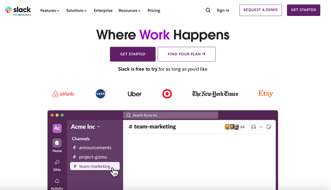
1. Slack
CTA: "GET STARTED" and "FIND YOUR PLAN"
Slack's primary CTA, "GET STARTED," uses clear, action-oriented language that emphasizes beginning the journey without mentioning signup or registration. They pair this with a supportive message: "Slack is free to try for as long as you'd like," removing any cost concerns.
The secondary "FIND YOUR PLAN" CTA provides an alternative path for users who want to explore pricing options first, effectively catering to different decision-making styles.
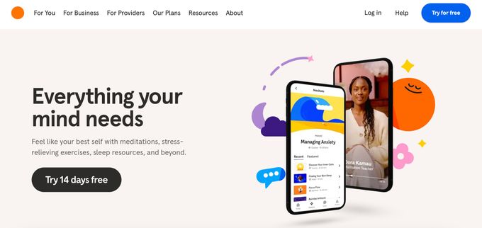
2. Headspace
CTA: "Try 14 days free"
Headspace's homepage CTA clearly communicates the specific trial period while emphasizing the word "free" to remove cost barriers to entry. This direct approach immediately lets visitors know what they'll get and for how long, eliminating uncertainty.
The CTA is supported by benefit-focused copy that explains how the app will help users "Feel like your best self" through various features. This creates a compelling value proposition that addresses emotional needs rather than just listing features.
Blog and content CTAs
3. Ahrefs
CTA: "Sign up for Ahrefs"
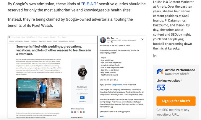
Ahrefs places their prominent orange CTA button, "Sign up for Ahrefs", in their blog sidebar, creating strong visual contrast that draws the reader's attention.
The direct approach clearly communicates the desired action, while the supporting text below ("Get SEO metrics of any website or URL") explains the immediate value users will receive after signing up.
This works well because it connects their content (which often discusses SEO topics) with a clear path to using their tool to implement what readers are learning about.
» Learn how to boost your blog's SEO with our content audit guide.
4. HubSpot
CTA: "Download for Free"
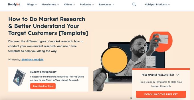
HubSpot's blog posts feature highly relevant content upgrades with clear CTAs like "Download for Free." What makes this effective is how perfectly it aligns with the blog content—offering a market research kit on an article about market research.
The CTA button uses a contrasting orange color that stands out against the white background, while the descriptive text above ("5 Research and Planning Templates + a Free Guide on How to Use Them") clearly communicates the specific value readers will receive.
Email marketing CTAs
5. Spotify
CTA: "LEARN MORE"
Spotify's email promotes their expanded music video feature with a clean, straightforward "LEARN MORE" CTA button. What makes this effective is the context-setting headline "Dive deeper into the music you love" and supporting copy that explains the new capability.
The CTA creates curiosity while the surrounding text clarifies the value proposition—being able to both watch and listen without choosing between them. The contrasting pink button against the blue background ensures the CTA stands out visually, making it impossible to miss.
6. Grammarly
CTA: "Start Translating"
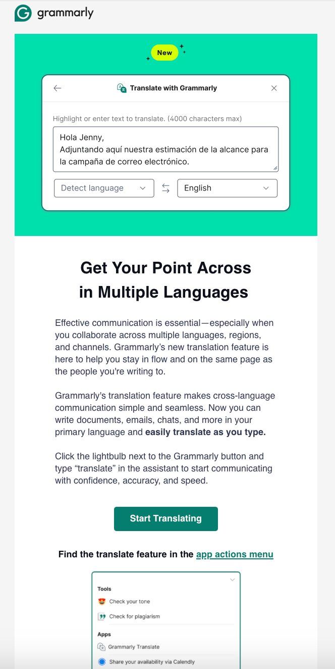
Grammarly's translation feature email uses an action-oriented "Start Translating" CTA that perfectly aligns with the email's value proposition. The teal button stands out against the white background while maintaining brand consistency.
This CTA works because Grammarly first demonstrates the feature visually, explains its benefits clearly, and then provides a direct conversion path to using it immediately.
Social media CTAs
7. Semrush
CTA: "Comment 'HOT"
Semrush's Instagram post uses an engagement-focused CTA that cleverly encourages comments by promising personalized value in return. This approach works brilliantly for social media because it drives immediate engagement and creates an opportunity for direct communication with followers.
The use of urgency words like "moving fast" combined with the simple action required ("Comment 'HOT'") makes this CTA effective at generating responses.
8. Stanley
CTA: "Grab your baskets!"
Stanley's Instagram post uses a seasonally relevant CTA that creates urgency around their limited Easter product release. The CTA cleverly ties into holiday traditions while prompting immediate action.
By specifying exactly when the products will be available ("tomorrow, 3/28 starting at 9:00 AM PT") and implying scarcity ("hidden on our website"), Stanley creates excitement and FOMO.
E-commerce CTAs
9. Sony
CTA: "Step closer to reality"
Sony's homepage CTA for their 8K TV uses evocative language that connects the product's benefit directly to the user experience. Rather than generic phrases like "Learn more" or "Shop now," the "Step closer to reality" button creates intrigue while promising an immersive viewing experience.
This approach works because it emphasizes the emotional benefit (a more realistic, immersive experience) rather than just technical specifications.
» Discover tried-and-tested e-commerce CRO tips to increase revenue.
10. Sephora
CTA: "Add to basket"
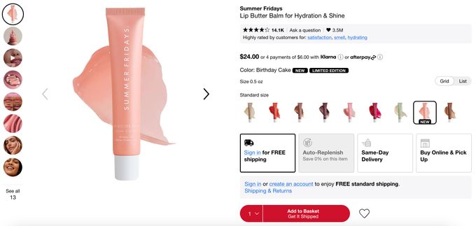
Sephora's product page features a prominent red "Add to Basket" CTA button. What makes this CTA effective is how it's supported by additional free shipping options, same-day delivery, and the ability to buy online and pick up in-store.
The button includes supportive text "Get It Shipped" that clarifies what happens next, while the limited edition labeling and color selection options create a sense of urgency and exclusivity.
» Turn traffic into sales with these CRO best practices.
App and software CTAs
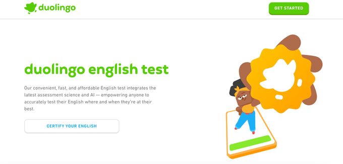
11. Duolingo
CTA: "CERTIFY YOUR ENGLISH"
Duolingo's focused CTA emphasizes the outcome users want rather than the process. Instead of generic phrasing like "Take the test," it highlights the end benefit—certification. The clean white button provides a clear visual path to action while maintaining brand consistency with Duolingo's playful aesthetic.
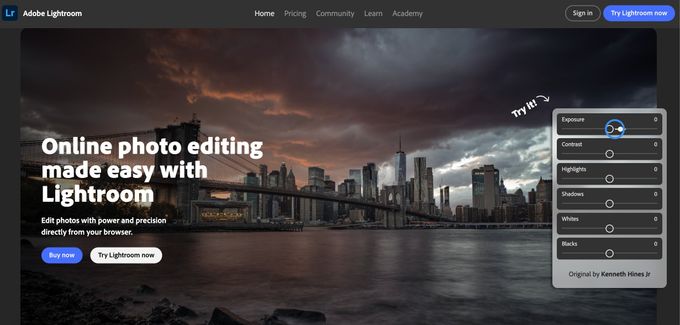
12. Adobe Lightroom
CTA: "Try Lightroom now"
Adobe's homepage features a friendly "Try Lightroom now" button in bright blue that pops against the stunning cityscape background. This CTA works well because it invites visitors to jump right in without any pressure to buy.
The page cleverly shows off what you can actually do with the software by including interactive editing sliders right there on the screen.
Mastering the art of CTAs
The best CTAs don't just ask for action—they offer clear value at the perfect moment in the user journey. They're the crucial bridge that turns readers into participants and browsers into customers.
Success comes from understanding what your audience wants, using compelling language that inspires action, making your CTAs visually stand out, and continuously testing what works.
» Try Entail CRO for free and start transforming your content into a conversion engine.
