20 steal-worthy call to action examples that drive results in 2026
Explore effective call to action examples that guide users, inspire clicks, and turn interest into action.
Updated May 12, 2025

AI Summary
A call to action (CTA) is the critical tipping point that leads visitors to take a desired action—whether that's making a purchase, booking a demo, or joining an email list. The magic of a well-crafted CTA is its ability to capture attention, spark engagement, and smoothly guide users through their journey without feeling too salesy.
But creating the perfect CTA that inspires that next click, signup, or purchase is often easier said than done. So, let's look at some examples of impactful CTAs across different channels.
Key takeaways
- CTAs guide users through their journey toward conversion.
- The key to creating an effective CTA is aligning them with the user journey.
- By using CTAs that are contextually relevant, you can reach click-through rates of over 45%.
What is a call to action?
A CTA is a short text prompt—usually a button or clickable text—that encourages users to take a specific action on your site, ad, or email. CTAs guide users toward the next step in their journey, drive engagement, and ultimately convert visitors into leads or customers.
CTAs can take many different forms, including:
- Buttons
- Contextual links
- Clickable images
- Plain text
- Pop-ups
- Banners
» Discover proven techniques to increase conversions and boost SEO ROI.
How to create click-worthy calls to action
To write an effective CTA, you need to capture attention and encourage action. Here are some tips to help you craft CTAs that resonate with your audience and boost conversions.
» Increase conversions with conversion rate optimization.
Understand your audience and their needs
Start by pinpointing your audience's pain points, desires, and motivations. Knowing what they need allows you to create CTAs that speak directly to their goals.
For instance, if they're looking to save time, a CTA like "Streamline your workflow" can resonate because it directly addresses their needs. Be sure to position your product as the solution within the CTA to make it clear that taking this action will bring them closer to what they want.
» Get to know your audience by learning about the stages of the user journey.
Use powerful action words
Strong CTAs rely on compelling verbs that inspire action, like "Get," "Start," or "Discover." These words create a sense of urgency and excitement that nudges users to take the next step.
Keep your CTAs concise—typically under five words—so they're easy to process quickly. Short and sweet CTAs like "Start free today" or "Unlock your savings" go a long way toward capturing attention and motivating clicks.
» Learn the key steps of content editing to create better content.
Place CTAs strategically
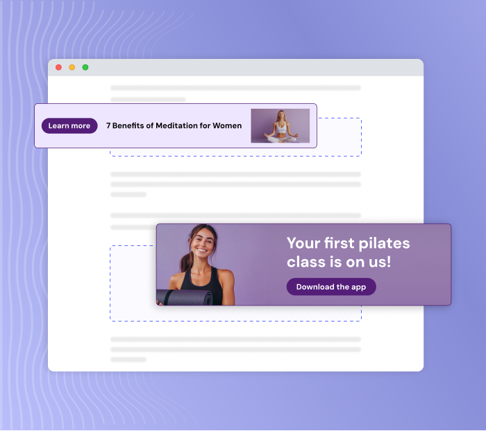
Users are more likely to click on CTAs or links that are highly relevant to the content they're reading. In fact, we're seeing click-through rates above 45% when CTAs are contextually relevant and well-placed. So, look at each piece of content and add CTAs that align with every section—whether contextual links, widgets, buttons, etc.
By ensuring that each CTA keeps the user in the same context while sending them further down the funnel, you'll boost both click-through and conversion rates.
» Want to increase CTR with targeted CTAs? Try Entail CRO for free.
Align CTAs with the user journey
Just like when you build an SEO funnel, the golden rule when creating CTAs is that every page should link to relevant content at the same funnel stage or one lower. However, many sites still use bottom-of-the-funnel CTAs in top-of-the-funnel content where users aren't ready to convert. That's not best practice.
Instead, you should use CTAs that align with the user's funnel stage to guide them to the logical next step in their journey. In a top-of-the-funnel article, link to upper- or mid-funnel pages and to bottom-funnel content when users are further along in the funnel.
20 best call to action examples for 2026
1. HubSpot
CTA: Grow better with HubSpot
HubSpot is a B2B SaaS company that sells a fairly complex product. Their CRM has multiple features, so users may want to understand its value and functionality before they feel confident purchasing it. That's why these CTAs are so effective. They offer users two low-risk options to get to know the product better.
"Get a demo" provides a guided tour for users who want to see the product in action before committing, while "Get started free" appeals to those who prefer hands-on exploration without financial commitment. These choices reduce friction and make it easier for potential customers to try the CRM, which can increase their chances of conversion.
» Get more sales with these conversion strategies.
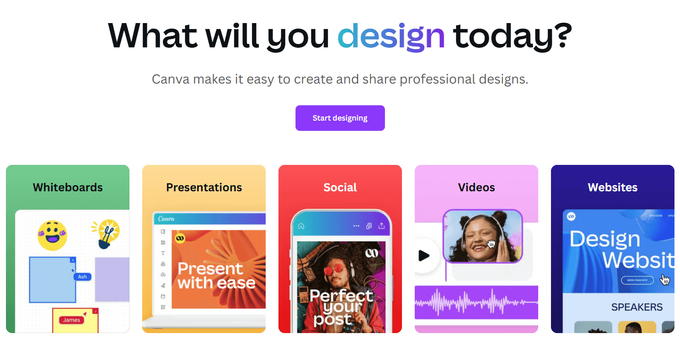
2. Canva
CTA: Start designing
Canva is a design tool that allows users to create a variety of content in interesting visual formats, from presentations to social media posts. Using a simple, action-oriented phrase like "Start designing" as the most prominent CTA on their homepage encourages users to jump in and create immediately. They could have opted for a generic CTA like "Sign up" or "Get started," but they chose a more creative approach that speaks directly to the user's goal and their main value proposition—designing.
» Target customer intent with intent-based marketing.
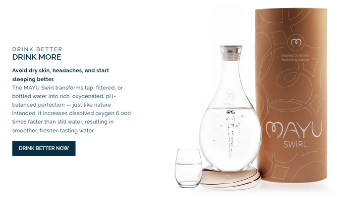
3. Mayu Water
CTA: Drink better now
Mayu Water sells an innovative product that improves the quality and taste of tap water. The CTA "Drink better now" speaks directly to the value the product offers—improving the quality of the water you drink. Since some users may not be familiar with this type of product, they also include a bolded line of text outlining the product's benefits and a short paragraph explaining how it works.
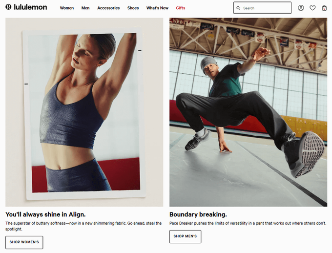
4. Lululemon
CTA: You'll always shine in Align | Boundary breaking
Lululemon does a great job of showing us that CTAs don't always need to be clickable. Their website is filled with interesting copy that inspires action by connecting their products with what their audience values. They use engaging and descriptive language to create a sense of aspiration and excitement around their products. This approach adds a touch of personality and subtly encourages customers to see themselves enjoying the product, which can be even more motivating than a traditional "Shop now" button.
» Learn how to guide customers through your sales funnel.
5. Glossier
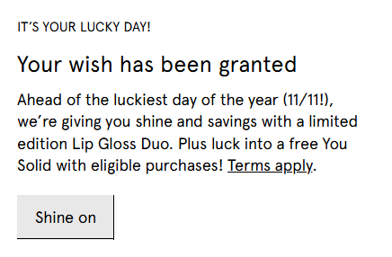
CTA: Shine on
Glossier is a beauty brand known for its makeup and skincare products. The CTA "Shine on" cleverly references their lip gloss while tapping into the user's desire to look and feel radiant (and get more makeup for less, of course). Paired with phrases like "It's your lucky day!" and "Your wish has been granted," this CTA feels more like an encouragement to indulge and less like an attempt at making a sale. Also, by adding a time-sensitive offer for the "luckiest day of the year (11/11!)," Glossier subtly urges customers to act quickly.
6. Tableau
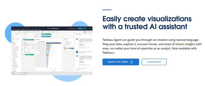
CTA: Learn more
Similar to HubSpot, Tableau's BI software requires some explaining before users feel confident enough to commit. By using a "Learn more" CTA, Tableau directs potential customers to informational pages where they can gain further insight into the platform's capabilities.
» Learn how to create content that converts.
7. Nerdwallet
CTA: NerdWallet's best rewards credit card
CTAs aren't limited to only buttons. Internal links are CTAs, too. In this example, NerdWallet provides a highly relevant internal link that leads to a bottom-of-the-funnel page on the best rewards credit cards from a mid-funnel page on how to choose a rewards credit card. This leads the user further down the funnel by providing the logical next step in their journey in a natural way, which means they're more likely to click it.
» Use Entail CRO to automatically create CTAs that are accurate to the context and intent of each section on every page.
8. Hotjar
CTA: Start now
This CTA widget from Hotjar can be found in their article on how to use heatmaps. Just like the NerdWallet example, this "Start now" CTA provides the user with a relevant next step in their journey. The widget itself is also interactive. The dark red spot moves with your mouse and looks like a heatmap—a super fun and engaging touch!
» Create, customize, and embed widgets with Entail CRO.
9. Gong
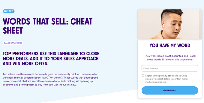
CTA: Grab the list
"Grab the list" is a clear, action-oriented CTA that aligns perfectly with Gong's "Words that sell" cheat sheet. It's simple yet engaging, and users instantly know what they'll get. Even though users need to provide their email to access the content, Gong uses casual language that lowers perceived effort, making users feel like getting the list is quick and easy.
10. Babbel
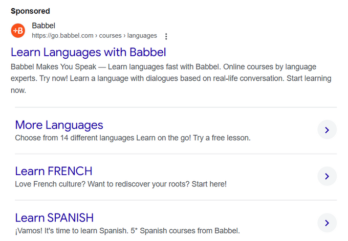
CTA: Learn languages with Babbel
"Learn languages with Babbel" is an excellent CTA for Babbel, a language learning app, because it's both informative and inviting. It clearly states the benefit—learning languages—while also reinforcing Babbel's brand as the solution. It also directly addresses what users search for ("how to learn a new language") and provides a straightforward path to achieving that goal.
11. Wix
CTA: Create a professional website
As a website builder, "Create a professional website" is a highly effective CTA for Wix because it clearly communicates their value proposition and matches the user's intent—building a polished, credible website. In a search ad, this clarity and appeal are essential, as users are more likely to click when they see an actionable solution that meets their needs.
» Discover whether you should invest in SEO or PPC.
12. Semrush
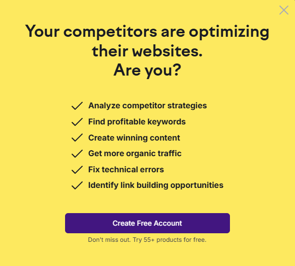
CTA: Your competitors are optimizing their websites. Are you?
In this CTA example, Semrush creates a sense of urgency and taps into users' competitive nature. Because this pop-up appears on their content pages, this CTA resonates with visitors who are already looking for SEO insights. The question format makes it engaging and personal while pushing users toward Semrush's tools as a way to "catch up" or get ahead.
13. Fashion Nova
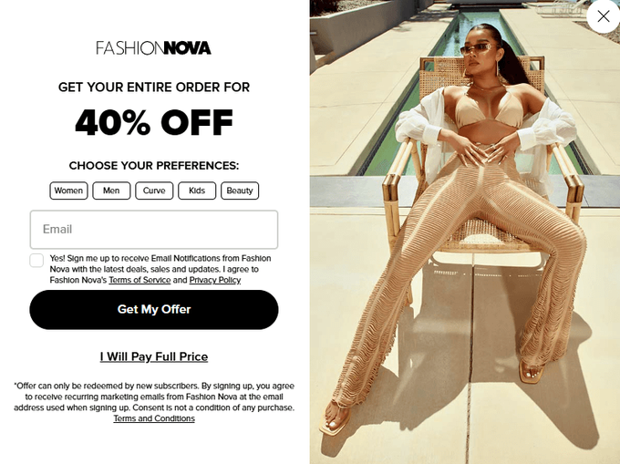
CTA: Get my offer
"Get my offer" works well as a CTA because it's direct and personal and encourages immediate action. The use of "my" makes the discount feel exclusive, adding a sense of ownership that urges users to claim it. Paired with an image of a model in a Fashion Nova outfit, the pop-up visually reinforces the brand's style and appeal, making the 40% discount even more enticing.
» Find out how to generate leads with SEO.
14. Grammarly
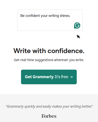
CTA: Get Grammarly, it's free
Who doesn't love a freebie? This CTA example from Grammarly combines a clear action with the appeal of zero financial commitment. Like with Semrush, placing this CTA pop-up on content pages where users are already focused on improving their writing makes it even more relevant and timely. It also contains a recommendation from Forbes, which boosts its effectiveness even more.
» Create compelling CTAs and widgets for your content pages. Try Entail CRO for free.
15. Descript
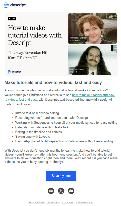
CTA: Save my seat
This CTA example comes from an email newsletter by Descript. "Save my seat" is a great CTA for their webinar because it's clear and personal. This phrase also gives users a sense that spots may be limited and that they should act quickly to reserve theirs. Not to mention, it makes the registration process feel quick and painless, which increases the likelihood of clicks from interested users.
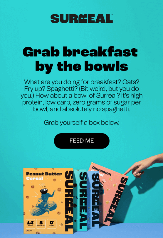
16. Surreal
CTA: Feed me
This one's a little more cheeky, which makes it all the more memorable. "Feed me" is the perfect CTA for an email campaign about cereal. It adds personality, and its lighthearted, casual tone aligns well with the brand and grabs attention in the inbox. The colorful design makes the email even more eye-catching and irresistible.
» Talk to an expert about how to create compelling CTAs for your business.
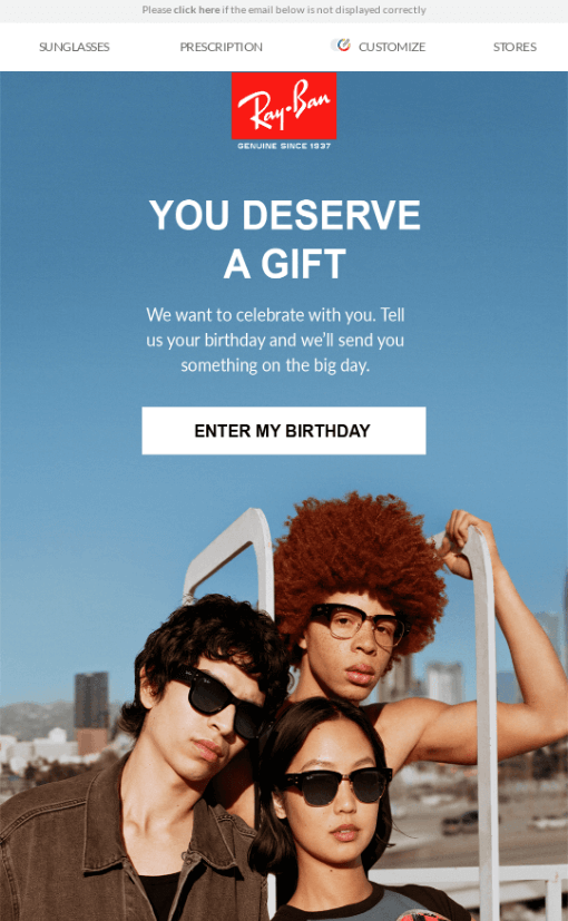
17. Ray-ban
CTA: Enter my birthday
Ray-Ban's CTA "Enter my birthday" works well because it makes users feel like the reward is specifically for them, and offering a gift for their birthday makes the action feel rewarding. It's also a smart way to generate leads since users need to sign up for marketing emails to unlock the reward, allowing Ray-Ban to build its contact list while offering something valuable in return.
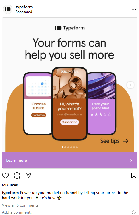
18. Typeform
CTA: Your forms can help you sell more
This example CTA from Typeform's Instagram ad clearly highlights the benefit of using their product—boosting sales. It speaks directly to businesses looking for practical ways to improve their sales process while creating the sense that they're missing out on something valuable. The CTA is simple and relevant, showing users how Typeform can help them achieve a specific goal, which makes it more likely they'll take action.
» Add social media to your SEO funnel to get more leads.
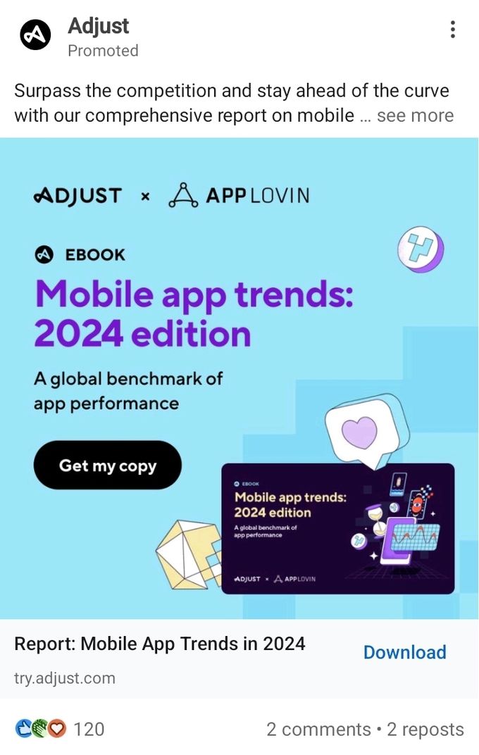
19. Adjust
CTA: Get my copy
A CTA like this one from Adjust's LinkedIn ad encourages immediate action by clearly offering users access to valuable content. As part of a LinkedIn ad, it speaks to a professional audience and offers them information that aligns with their interests, increasing the likelihood of engagement.
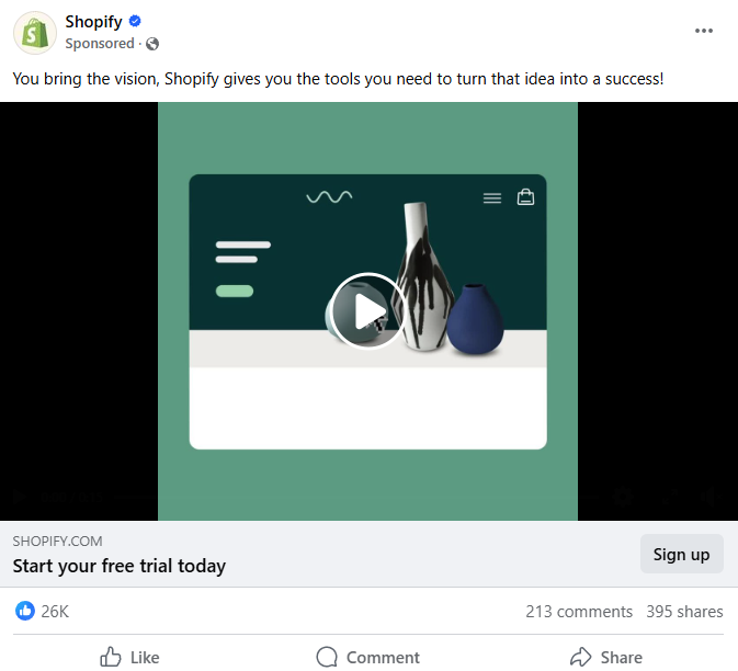
20. Shopify
CTA: Sign up
This CTA from one of Shopify's Facebook ads is simple but effective. The ad includes a video showcasing Shopify's features, which helps users understand how it can benefit their business in a visually appealing way. By adding "Start your free trial today" as an additional CTA, the ad emphasizes that signing up is risk-free, making it more appealing. This approach works well on Facebook, where users are looking for quick, actionable information in easy-to-digest formats.
Craft CTAs that convert
Using the right CTAs can make a huge difference in driving conversions and engagement, whether your goal is to educate, inspire, or prompt an immediate action. As we've seen from the examples above, effective CTAs are clear, compelling, and tailored to users' needs. Use them as opportunities to connect with your audience and move them closer to conversion. When creating your next CTA, remember that understanding the user journey and adding a touch of creativity can make a big difference in creating a seamless experience and getting better results.
» Book a demo to see Entail CRO in action, or try it for free.
